Data Visualizations
Here is a portfolio of data visualizations I made with Tableau
Americans vs Animals
Here’s my submission for Week 20 #Makeovermonday.
Click here for the interactive version
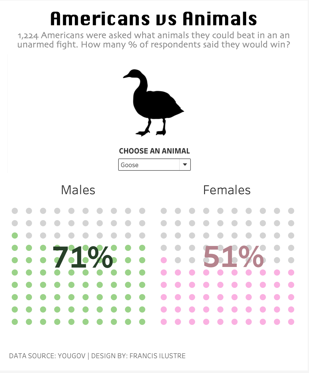
Andy Kriebel has an easy to follow tutorial on Waffle Charts using Data Densification .
Aside from the dataset from YOUGOV, another excel file was created for the densification data. It has a hundred rows and each value has a designated row and column number.

The densification data is then joined with the dataset from YOUGOV using a dummy calculated field.

Calculated Fields used:
//Below Value (M)
AVG([Male])<=AVG([Value])-0.001

//Below Value (F)
AVG([Female])<=AVG([Value])-0.001
It’s important to select the datapoints in the waffle chart, view the data and check if the Below Value computation is correct. In my case, I needed to subtract -0.001 from the AVG([Value]) so the “True” and “False” correctly falls in place.

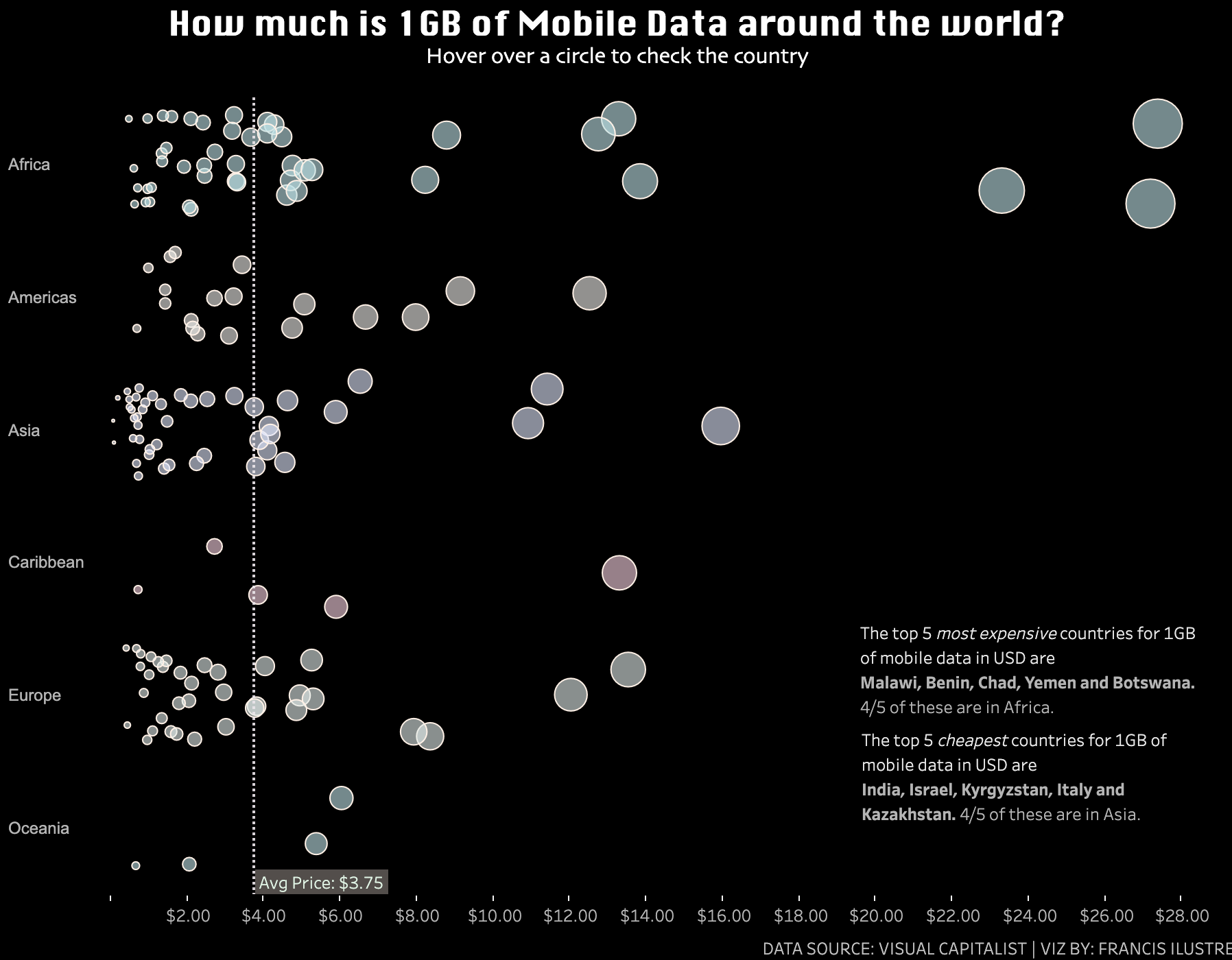
How Much is 1GB of Mobile Data Around The World?
Here’s my submission for Week 19 #Makeovermonday.
Click here for the interactive version
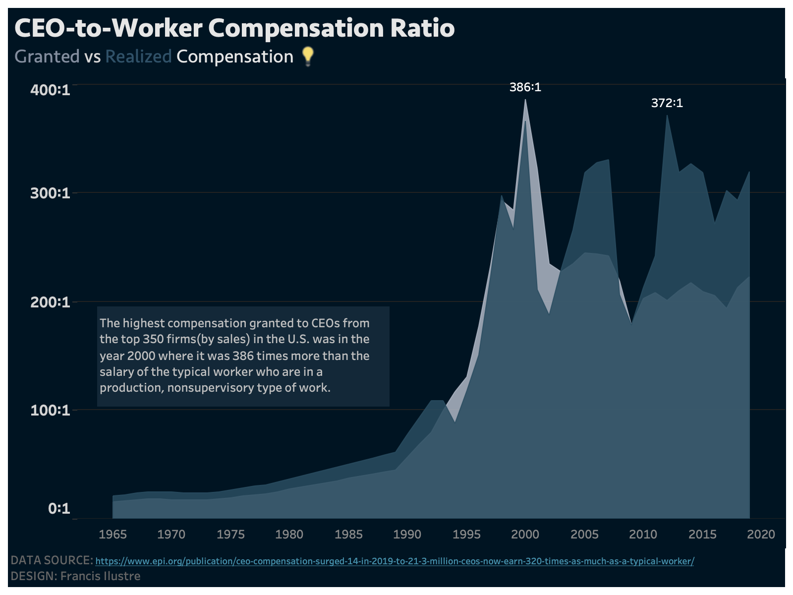
CEO-to-Worker Compensation
Here’s my submission for Week 18 #Makeovermonday.
No calculations needed here as the dataset already contains the CEO-to-Worer compensation ratios.
Click here for the interactive version
US Price Parity
Here’s my submission for Week 17 #Makeovermonday.
Click here for the interactive version
Hawaii really is an expensive place to live in. Also, does anybody know why goods in Nevada are really cheap?
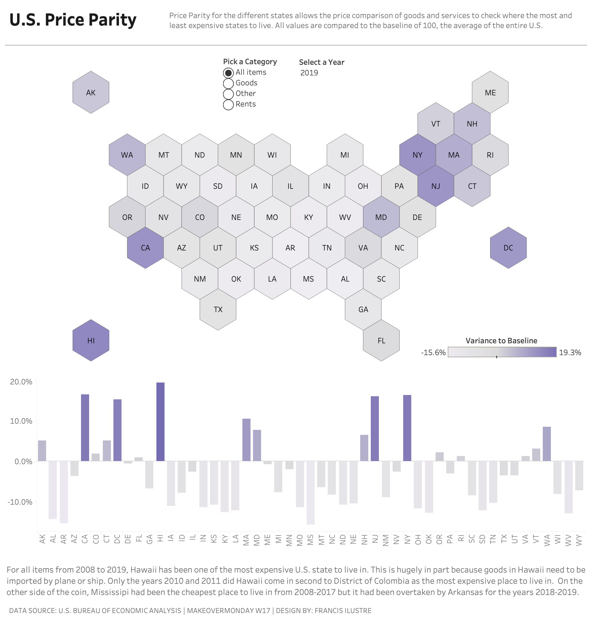
Notes:
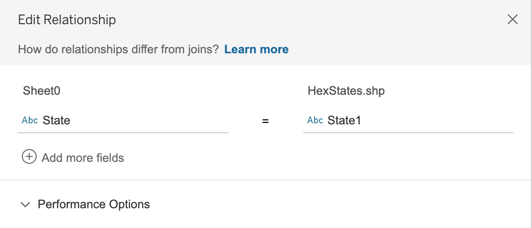
The spatial file to render a hex map of the U.S. is from Joshua Milligan
It’s loaded unto Tableau in a relationship with the U.S. Price Parity dataset using the state variables.
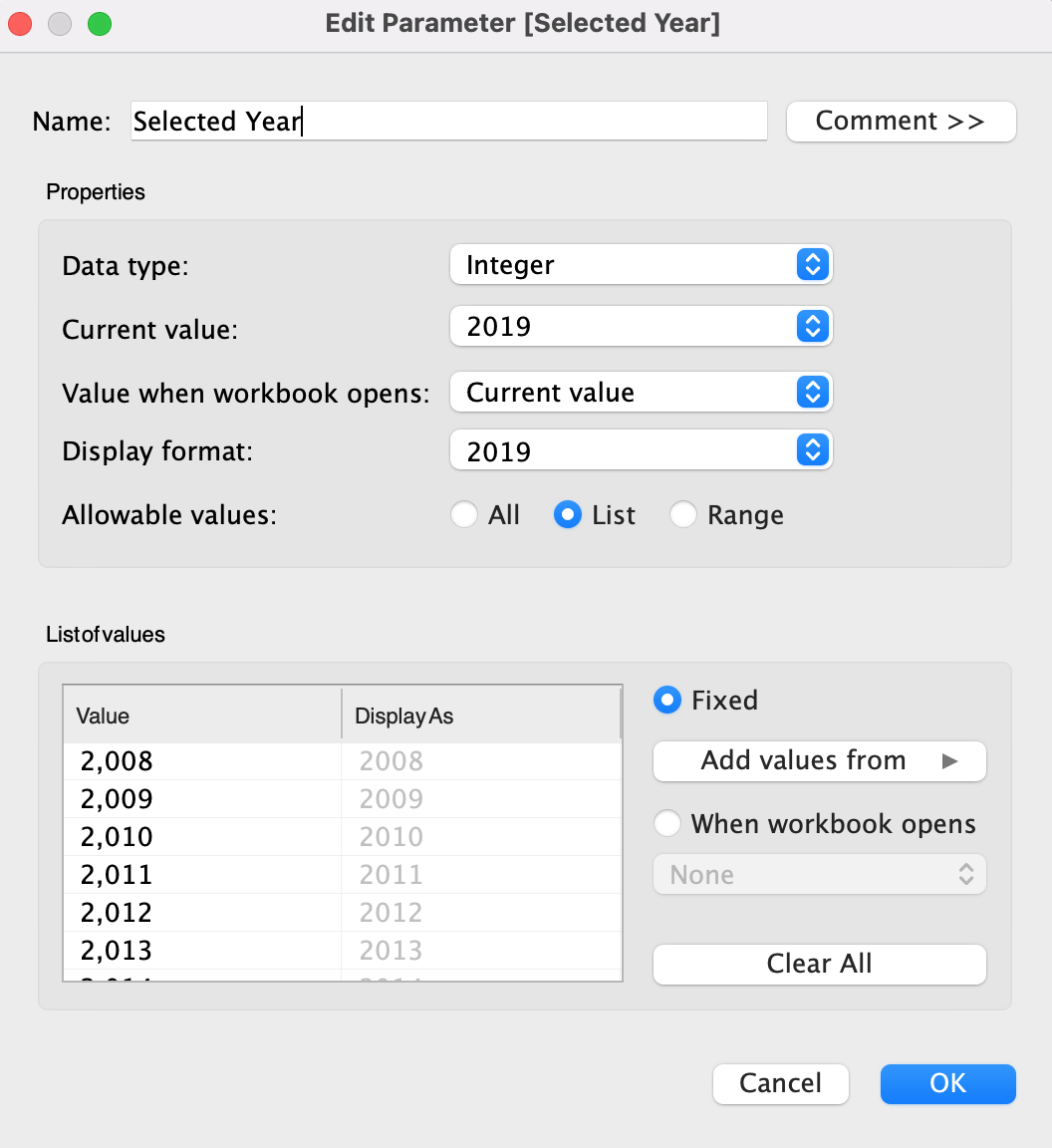
A parameter named “Selected Year” was created using a list > add values from > year then disabled the ‘include thousands separator’ from the display format.
For this visualization, the only calculation used is:
// Variance to Baseline
{ FIXED [State] : AVG( IF [Year]=[Selected Year] THEN [Index] END) - 100 }
The filter Description should be added to context or else the filter will not work.
Other helpful calculations to compare the parity change from different years:
// Parity Selected Year
{ FIXED [State] : AVG( IF [Year]=[Selected Year] THEN [Index] END) }

// Parity Comparison Year | Needs Comparison Year Parameter
{ FIXED [State] : AVG( IF [Year]=[Comparison Year] THEN [Index] END) }

// Difference Between Years Selected
[Parity Selected Year] - [Parity Comparison Year]
US TO PH Air Travel (2020 vs 2019)
This is my submission for Week 16 #Makeovermonday. The dataset comes from the Bureau of Transportation Statistics and contains 6.27 million rows.
I focused on US TO PH air travels (because I’m from the Philippines) and this is socially relevant to my network.
Click here for the Interactive Version
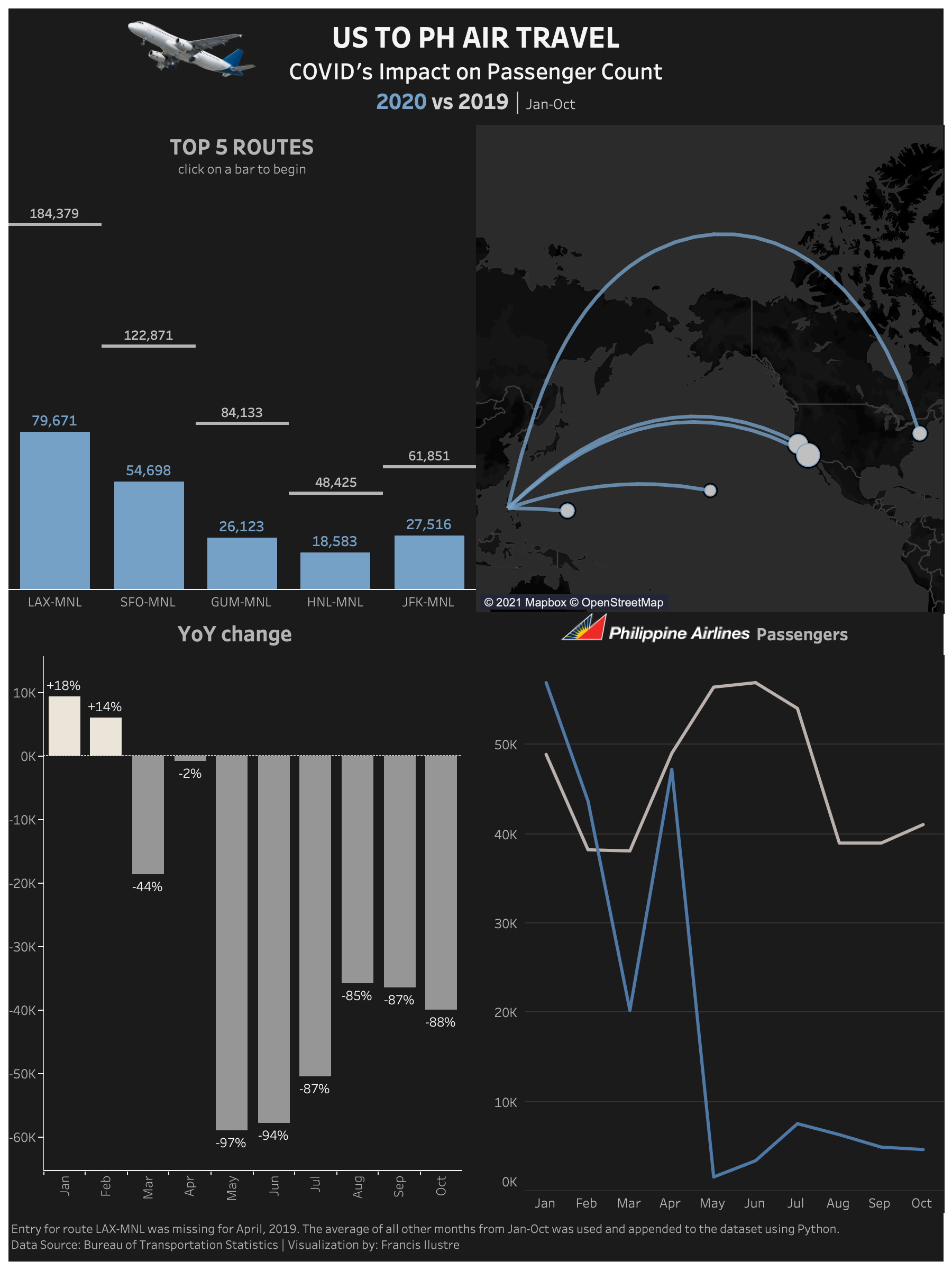
Here are my notes on this project just in case I would need to handle a similar dataset.
-
The Global Airport Database was needed for the Longitude and Latitude of the origin and the destination in order to display the locations on the map. The ‘US Monthly Air Passengers.csv’ must be inner joined with the Global Airport Database both for the origin and destination.

-
During data exploration, I noticed the entry for LAX-MNL on April 2019 was missing. It was spotted on the Philippine Airline’s line graph when the LAX-MNL route was used as a filter on the dashboard. The route is the most famous for travelling from the US to the Philippines and so a zero value on April 2019 became questionable. There was also no news regarding any closure on this route on that date. To replace the missing value, I averaged all other months from Jan to Oct of 2019 and used that as a value. I also decided to use Philippine Airlines Inc. as the carrier for this value as majority of flights from LAX-MNL are flown by this carrier. To append this value on the dataset, I needed to use Python because Microsoft Excel could only open up to 1+ million rows. Here’s the code I used using Terminal:
#Python Code for appending LAX-MNL for April, 2019 using Terminal:

import os
import pandas as pd
from csv import writer

path = os.getcwd()
file = path + '/Downloads/US Monthly Air Passengers.csv'

df = pd.read_csv(file)
df.columns  					#to check what columns are needed to be filled

laxmnl = [18438, 19564, "Philippine Airlines Inc.", "LAX", "Los Angeles, CA", "CA", "California", "US", "United States", "MNL", "Manila, Philippines", "", "", "PH", "Philippines", 2019, 4]

with open(file, ‘a+’, newline=‘’) as write_obj:
  csv_writer = writer(write_obj)
  csv_writer = writerow(laxmnl)

df = pd.read_csv(file)  #reload the file to check if the append was successful
df.tail()
- Helpful calculations:
// DATE
MAKEDATE([Year],[Month],1)

// Route
[Origin]+'-'+[Dest]

// 2019 Passengers | [Year]=2019 returns True or False; INT turns the True into a 1
INT([Year]=2019)*[Sum PASSENGERS]

// 2020 Passengers | [Year]=2020 returns True or False; INT turns the True into a 1
INT([Year]=2020)*[Sum PASSENGERS]

// 2020 Passengers by Carrier
{ FIXED [Carrier Name] : SUM(if [Year]=2020 THEN [Sum PASSENGERS] END)}

// 2020 Passengers by Route
{ FIXED [Route] : SUM(if [Year]=2020 THEN [Sum PASSENGERS] END)}

// 2020 vs 2019
SUM([2020 Passengers]) - SUM([2019 Passengers])

// 2020 vs 2019 %
[2020 vs 2019] / SUM([2019 Passengers])

// 2020 vs 2019 % Total
([Total 2020 Passengers] - [Total 2019 Passengers]) / [Total 2019 Passengers]

// Destination Point
MAKEPOINT([Dest Latitude],[Dest Longitude])

// Flight Path
MAKELINE([Origin Point],[Destination Point])

// Origin Point
MAKEPOINT([Origin Latitude],[Origin Longitude])

// Passengers for Selected Month | Gives the number of passengers for the amount you choose
{FIXED [Year]: SUM(INT([Month]=[Month Parameter])*[Sum PASSENGERS])}

// Passengers vs Selected Month
SUM([Sum PASSENGERS]) - SUM([Passengers for Selected Month])

// Total 2019 Passengers
{sum([2019 Passengers])}

// Total 2020 Passengers
{sum([2020 Passengers])}
- The Destination and Origin columns can be set to Geographical Role -> Airport
-
You can put the ‘+’ and ‘-‘ symbols for percentage changes on the 2020 vs 2019 % calculation:

- After mapping out the route, the map displays air travels from the US to Malabang Airport, an airport located in Lanao del Sur. This is very unlikely. Travelers from the US just don’t go there. I checked the Global Airport Database and the Malabang Airports IATA code is set to MNL. I had to change this to MLP.
Final Project for Data Visualization with Tableau by UC Davis
For the final project for Data Visualization with Tableau Specialization, I also chose COVID-19 as a topic because it is socially relevant right now. The were asked to write a project proposal which includes the executive summary, the design checklist and audience persona. You can read the document here
Although this was meant to be a single-frame visualization, you can also view the dashboard to check datapoints.
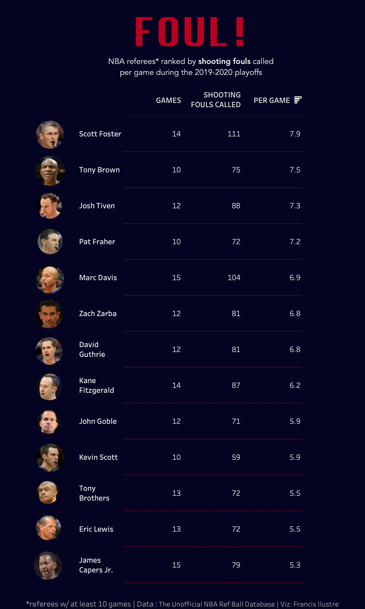
NBA Referees Ranked by Shooting Fouls during the 2019-2020 Playoffs
This is my submission for Week 15 #Makeovermonday.
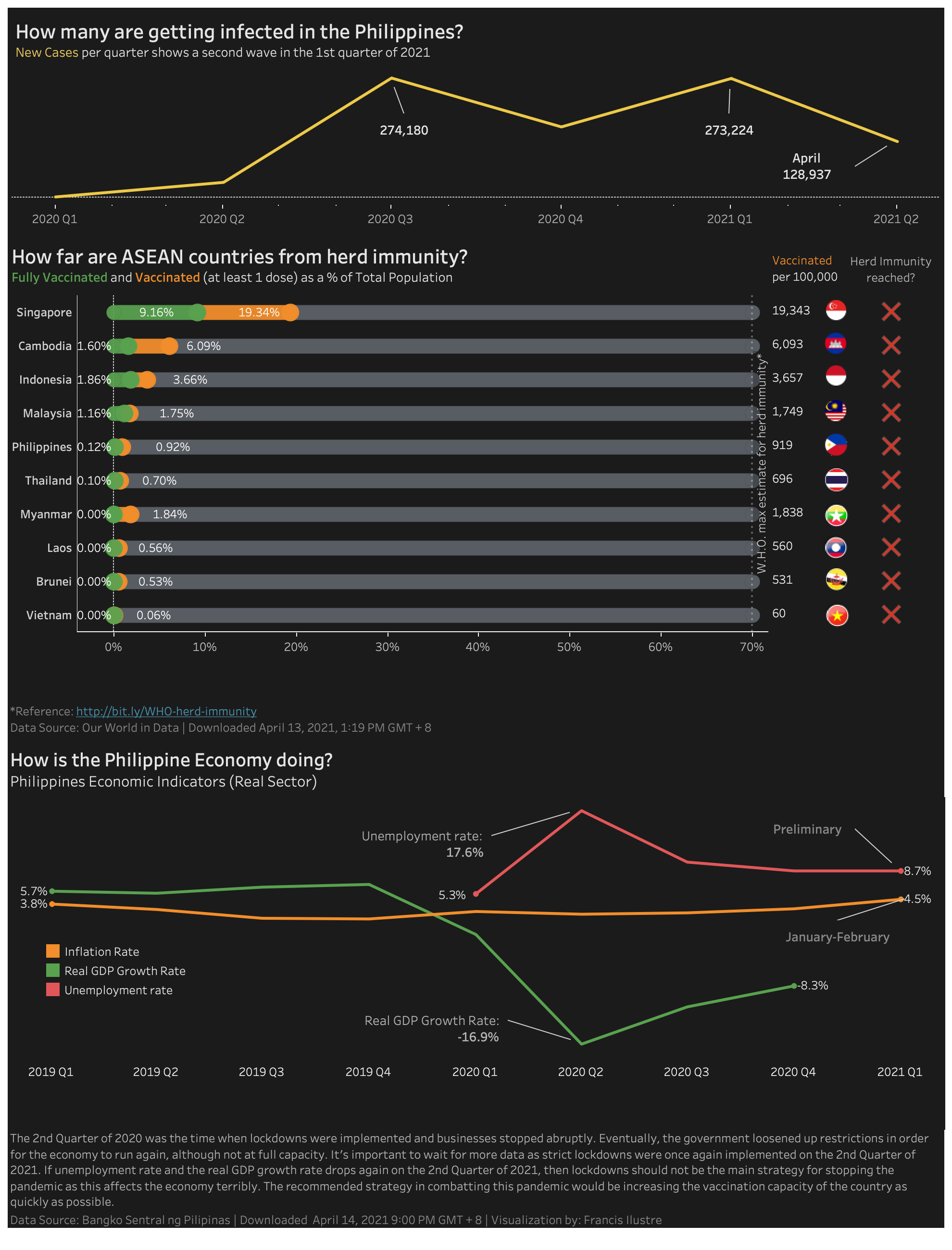
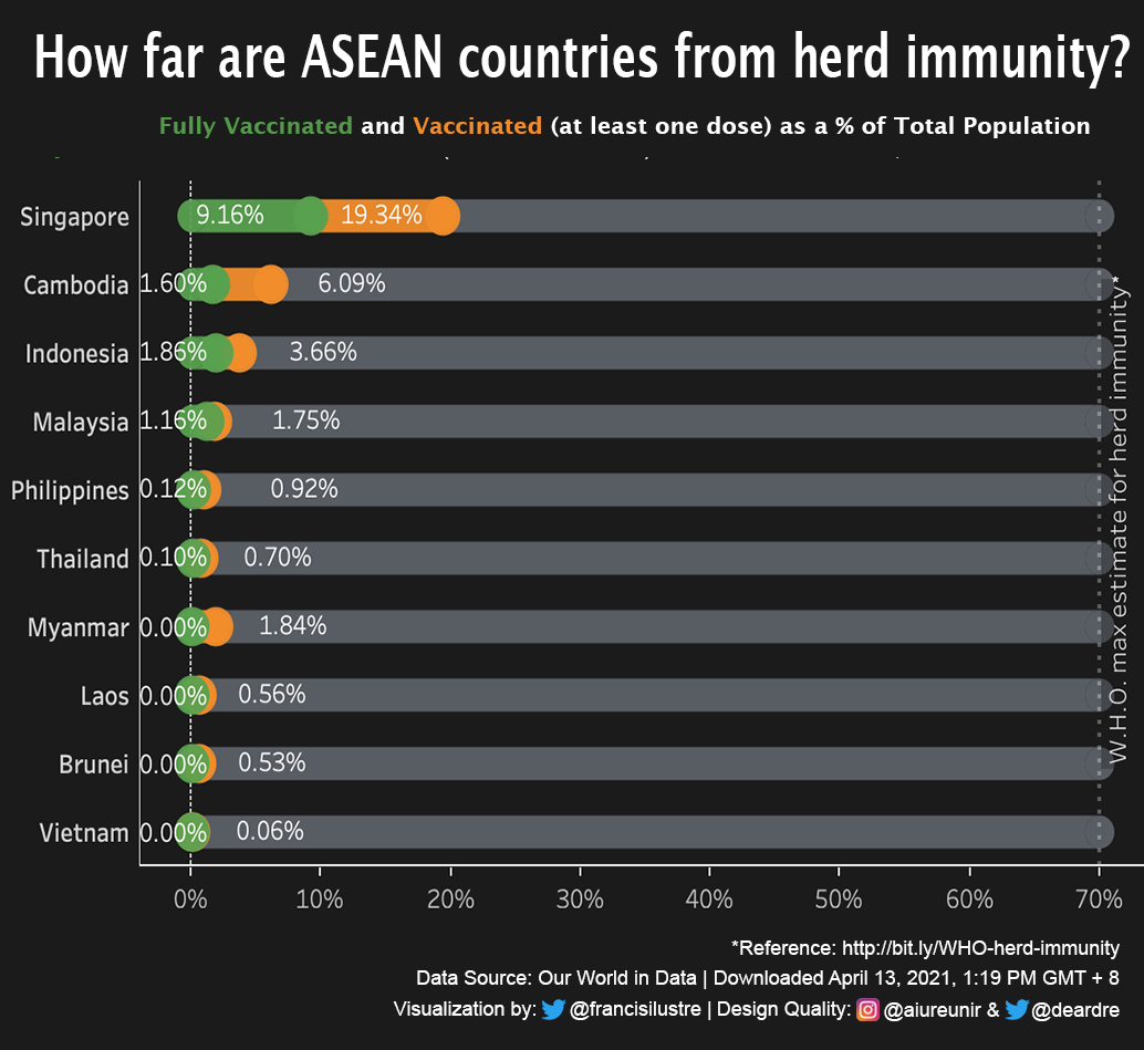
How Far are ASEAN countries from Herd Immunity?
Here’s my viz focusing on ASEAN countries’ progress towards herd immunity. The data from Our World in Data was downloaded on April 13, 1:19 PM GMT + 8. The dimensions of the visualization are fixed for viewing on mobile phones. I’ll update this again on May as more data comes in. Thanks to my friends for the design quality check!
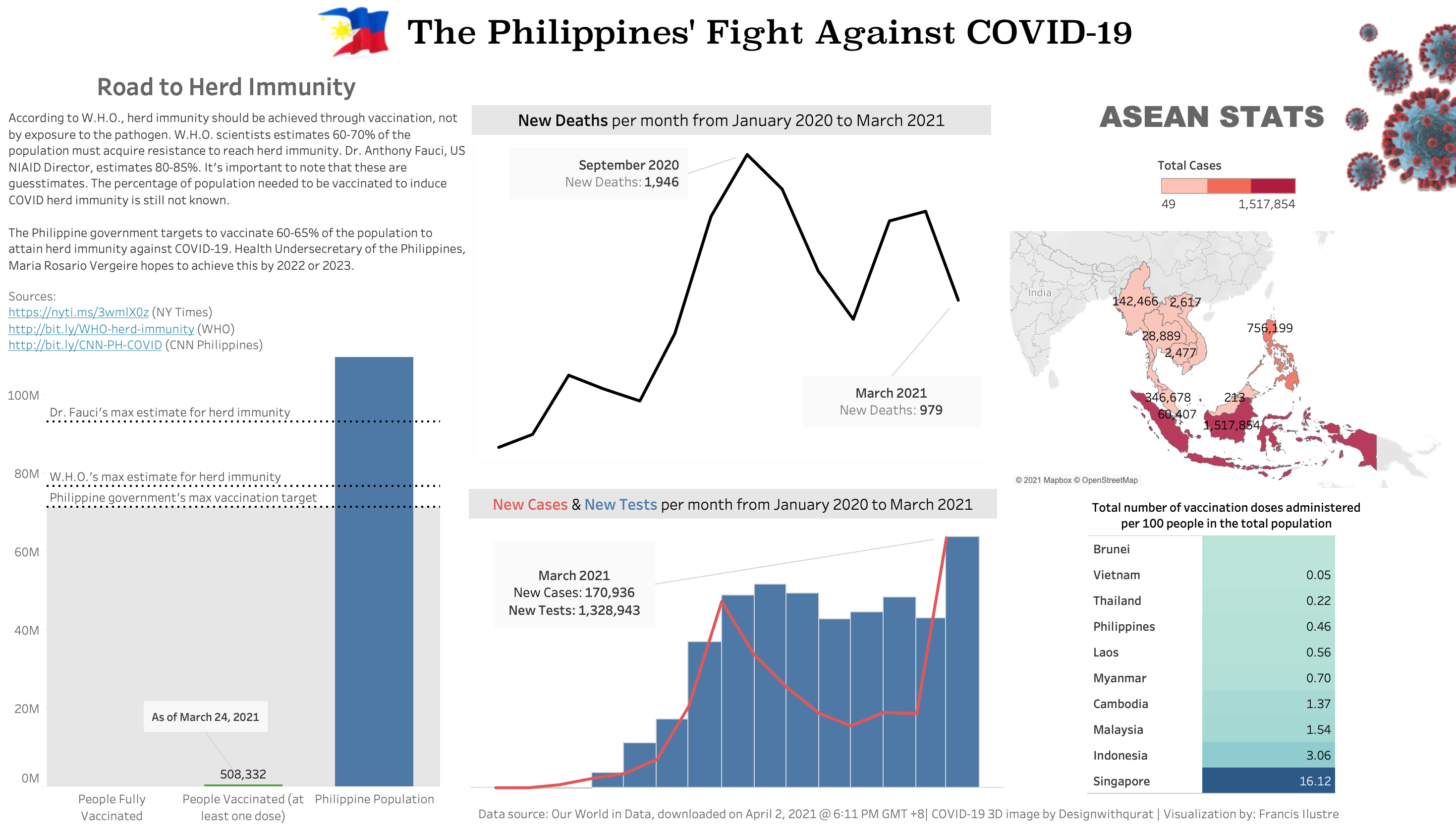
The Philippines’ Fight Against COVID-19
The dataset for these visualizations came from Our World in Data. The dataset was downloaded on April 2 2021 @ 6:11 PM GMT+8 If anything is amiss with the visualizations, please let me know!
Click here to view the full image
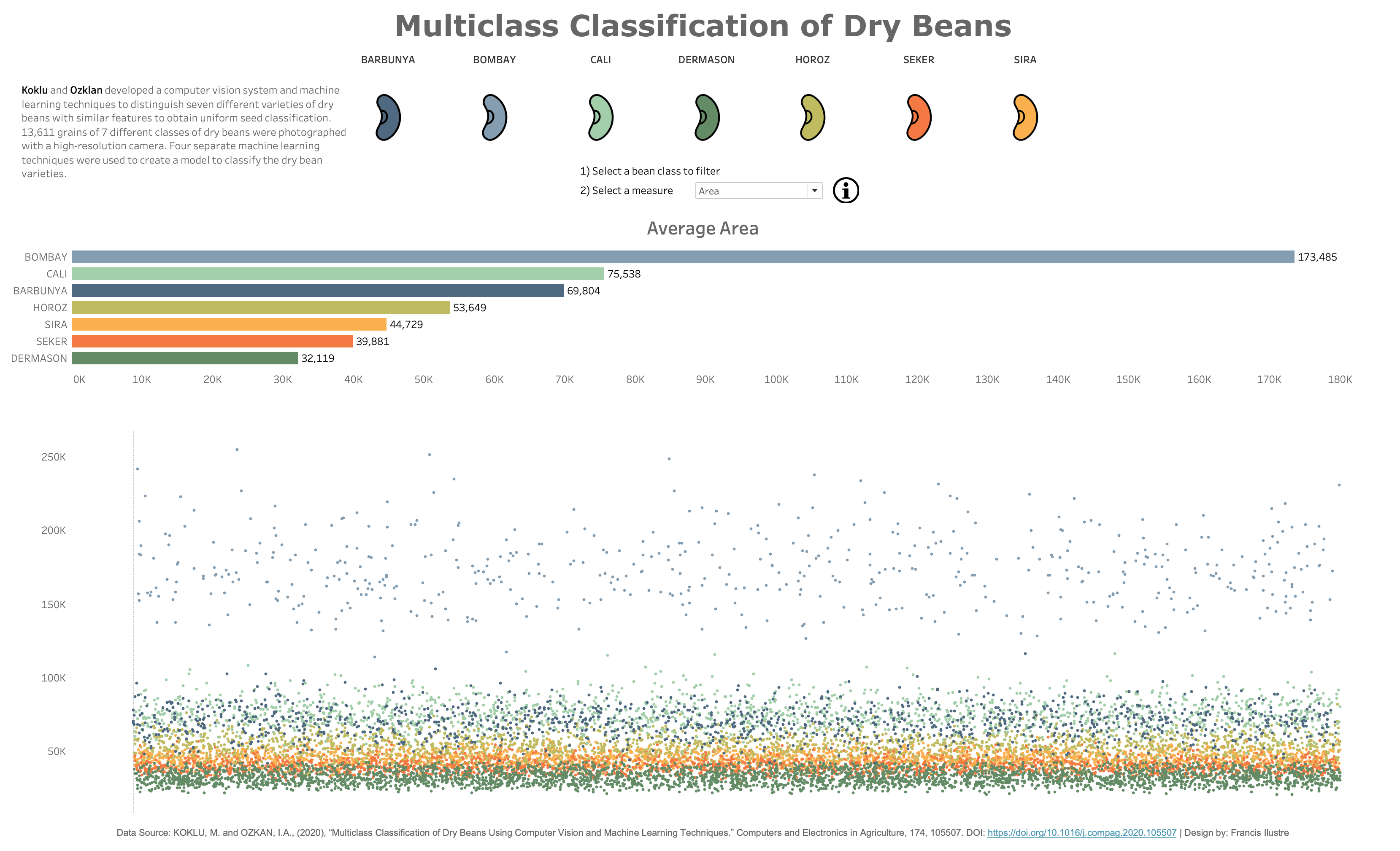
Multiclass Classification of Dry Beans
This is my submission for #Makeovermonday 2021 Week 14. The dataset is from a research paper titled “Multiclass classification of dry beans using computer vision and machine learning techniques”.
This is the first time I visualized a dataset from a research paper. I had totally no idea what to do so I got inspiration from Andy Kriebel’s Watch me Viz and Michelle Frayman’s visualization.
Click here to view the dashboard
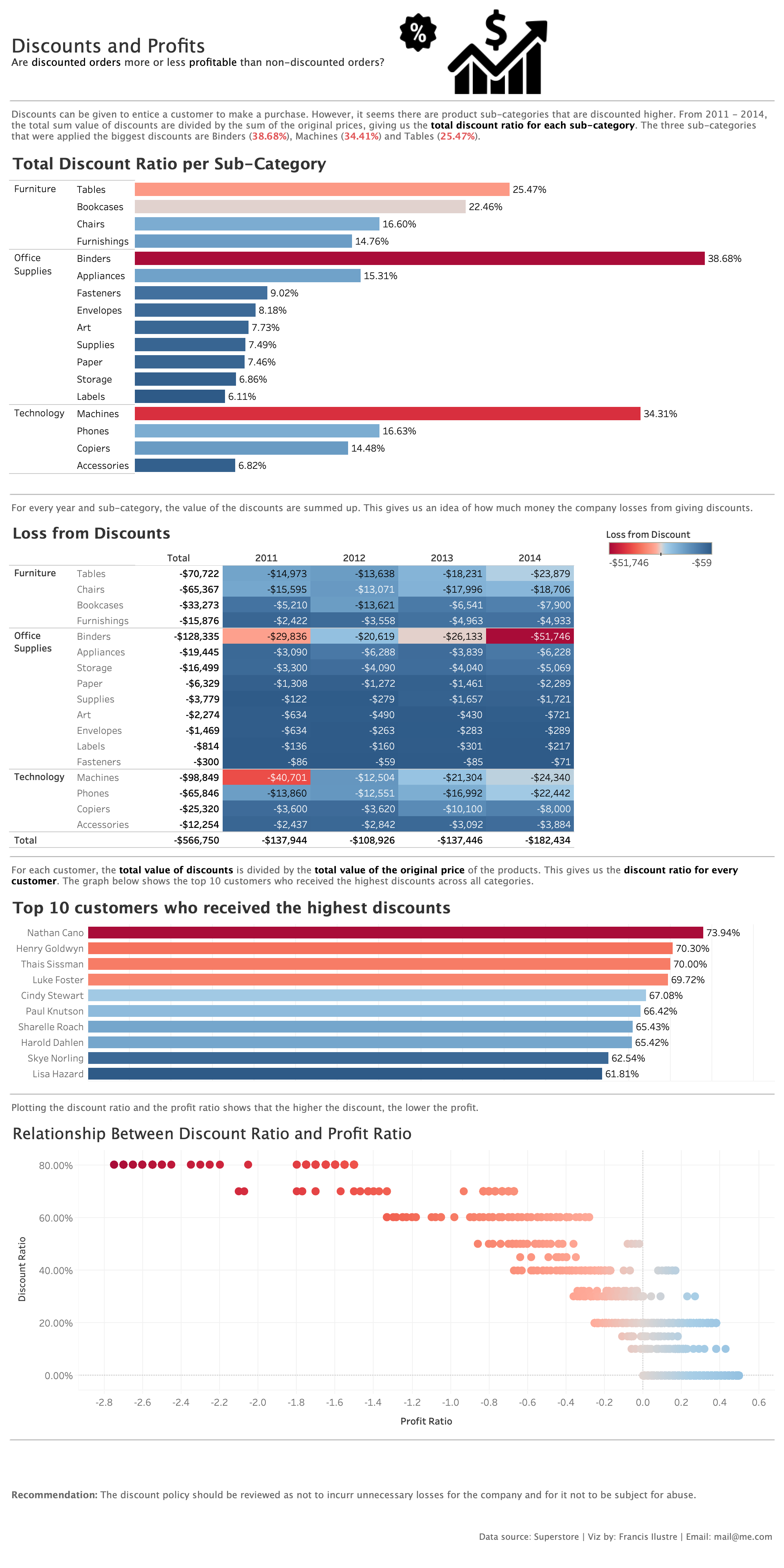
Superstore Discounts
This is an assignment for Creating Dashboards and Storytelling with Tableau
The interactive dashboard is meant to help answer the following business questions:
- How much is the company losing based on discounted sales?
- Are there customers who are receiving more discount than others?
- Are there certain product categories receiving more discount than others?
- Are there any inefficiencies that exist in the business operation?
Click here to view the dashboard
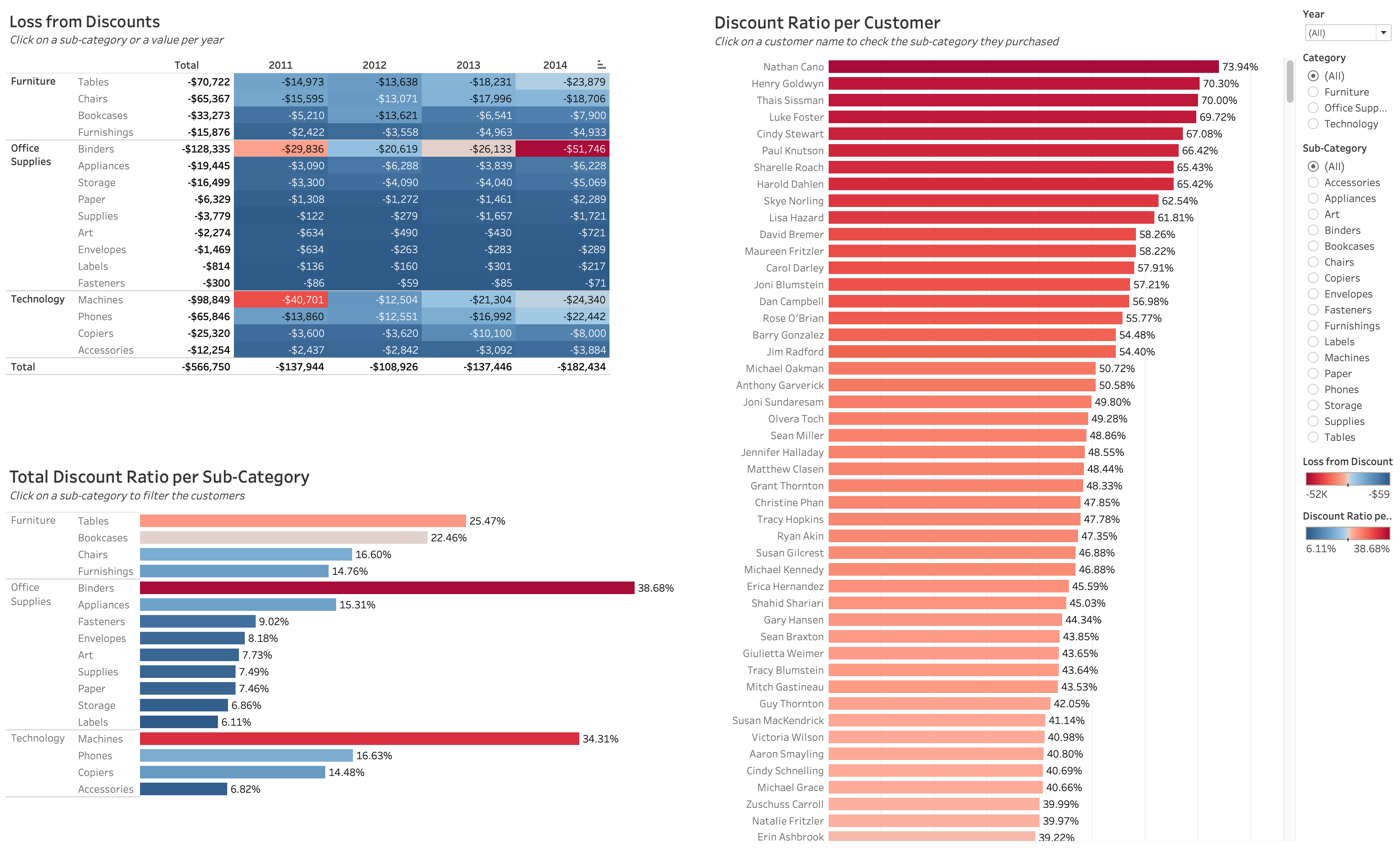
The bigger the discount and the more frequent a discount is given to a customer, the bigger the company loses. There are customers who have received more discounts than others. Binders, machines, tables and bookcases are being discounted higher than other sub-categories.
The policy on discounts should be reviewed for it not to result in big and unnecessary losses for the company.
In addition to the interactive dashboard, we were also asked to create a single-frame visualization:
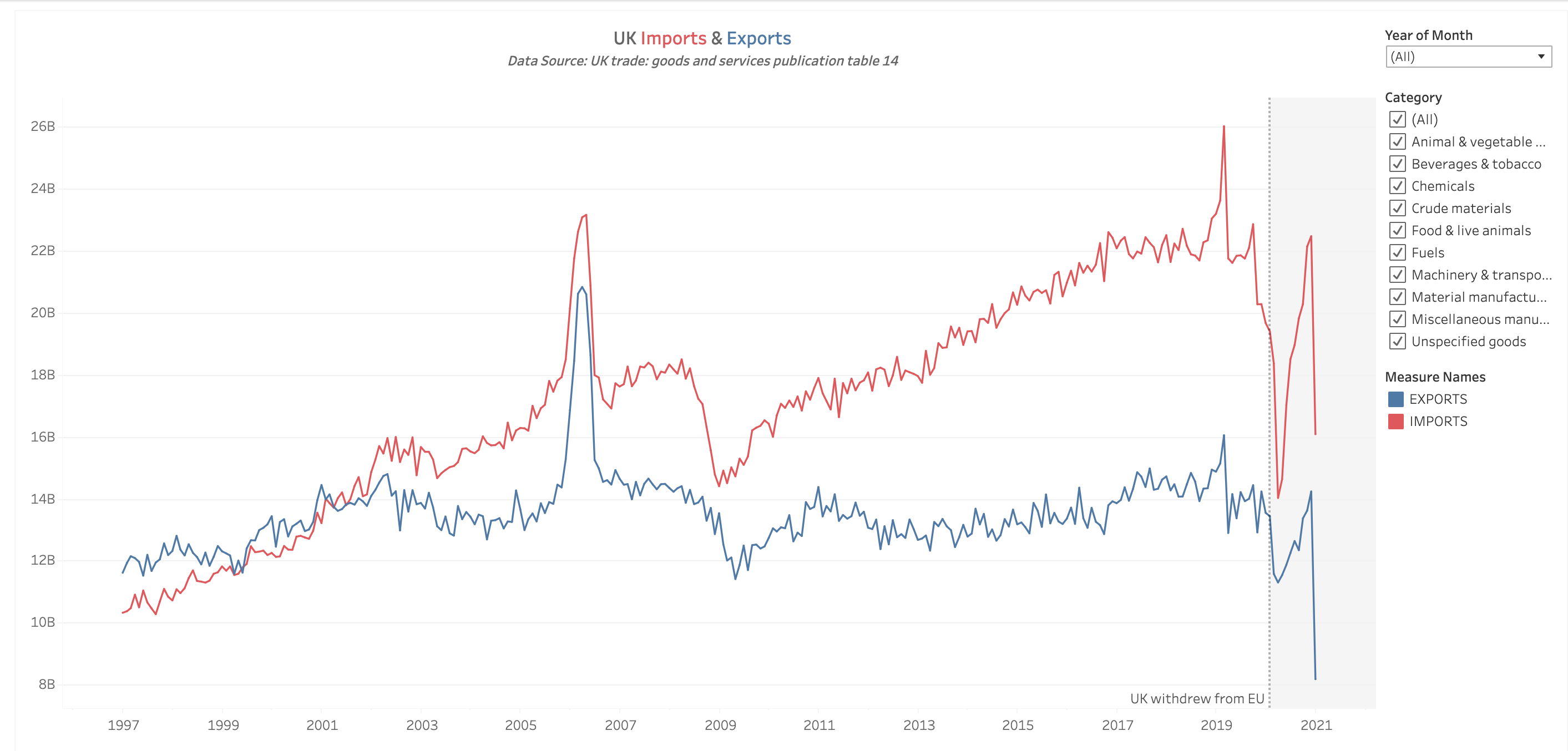
UK Imports & Exports
This is my submission for #Makeovermonday. The graph to be made over was posted in The Guardian. The dataset came from ONS - UK trade goods and services publication table 14
Click here to view the dashboard
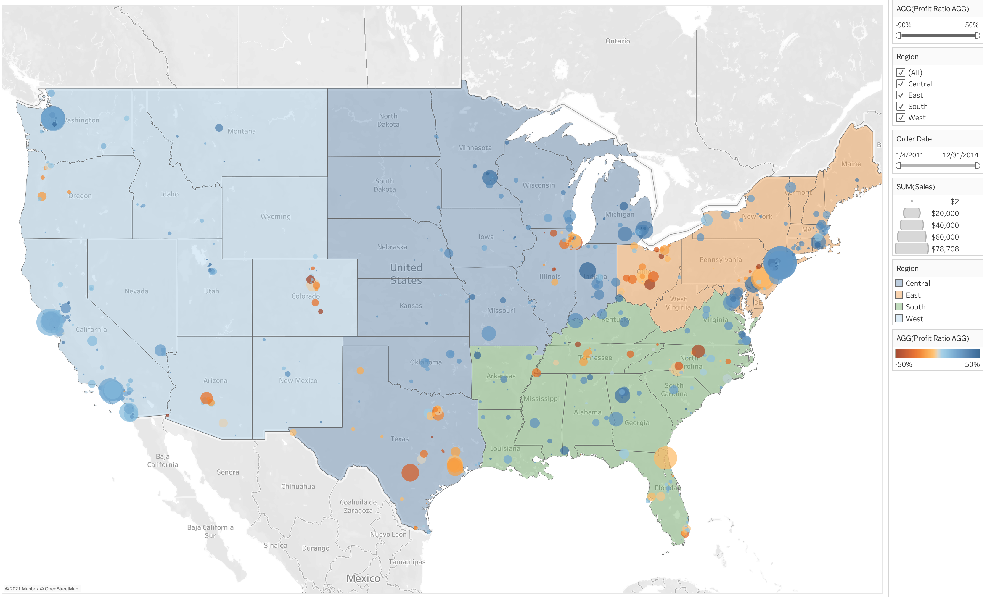
Superstore Dual Layer Maps
This is a visualization for the assignment in Visual Analytics with Tableau. The task is to create dual layer maps. It should show total profit by postal code, colorized by profit ratio, sized by total sales and show the regions of the United States. The region, profit ratio and order dates should be available as filters.
Click here to view the dashboard
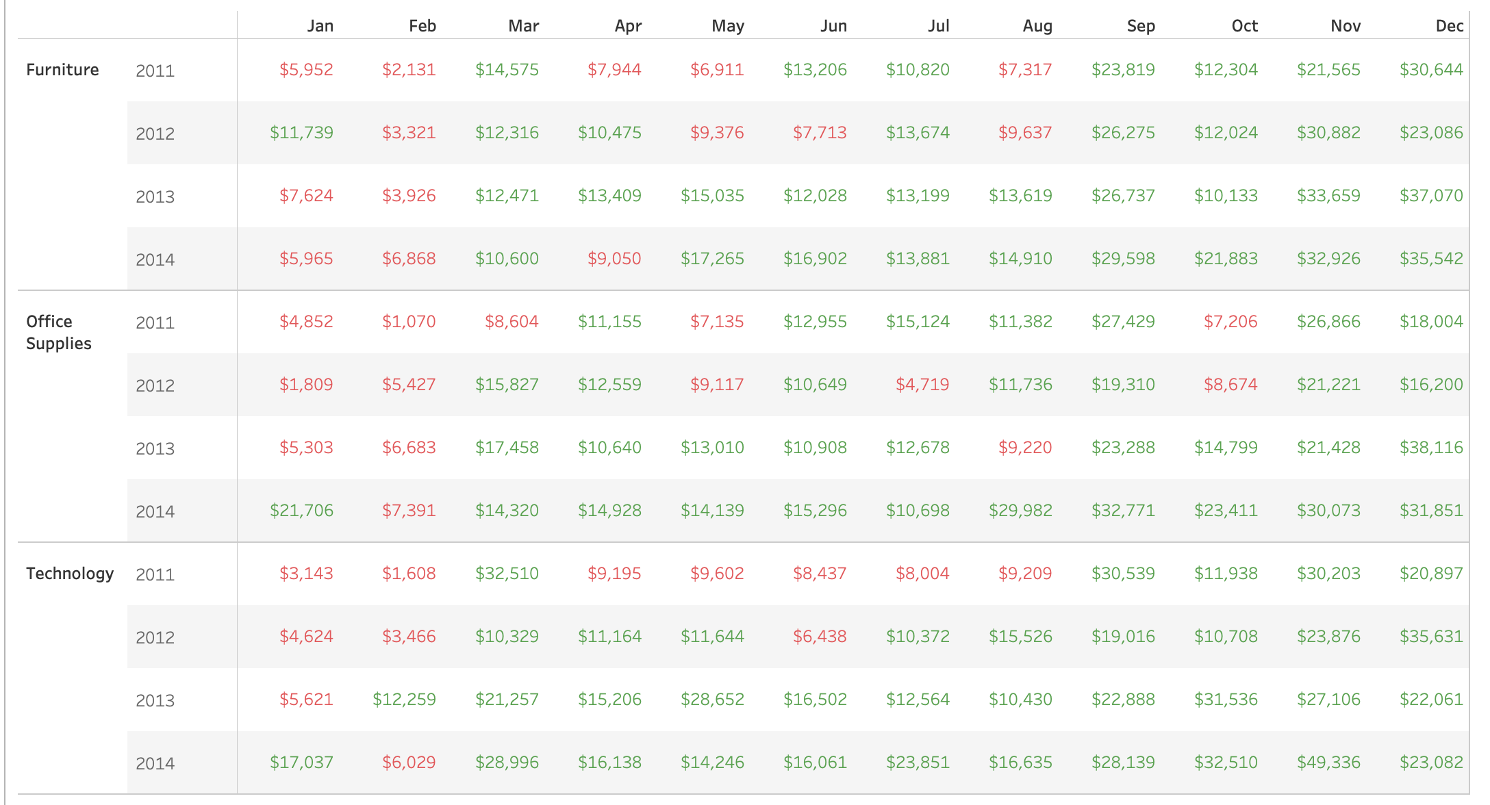
Superstore Sales Spotlight
This is a visualization for the assignment in Visual Analytics with Tableau. The task is to create a table showing total sales by product category, broken down by Year and Month.
A new calculation named “Sales Spotlight” is needed to categorize the total sales into “Good” if it’s above $10,000 and “Bad” if the total sales is lower than $10,000. The code for the calculated field is:
IF SUM([Sales]) > 10000 THEN "GOOD" ELSE "BAD" END
The following were also required: A Region filter, colorizing the table using the Sales Spotlight field, and including Profit in the tooltip.
Click here to view the dashboard
Superstore Shipping Details
This is a visualization for the assignment in Visual Analytics with Tableau. The instructions were to create a filled line chart to display the number of shipments per week for Q4 2014 by Shipping Status category. The Shipping Status category was made using a calculated field using the following code:
IF [Days to Ship Scheduled] - [Days to Ship Actual] < 0 THEN 'Shipped Late'
ELSEIF [Days to Ship Scheduled] - [Days to Ship Actual] > 0 THEN 'Shipped Early'
ELSEIF [Days to Ship Scheduled] - [Days to Ship Actual] = 0 THEN 'Shipped on Time'
END
The chart is colorized by Shipping Status. Order Date, Ship Mode and Ship Status are available as a filter.
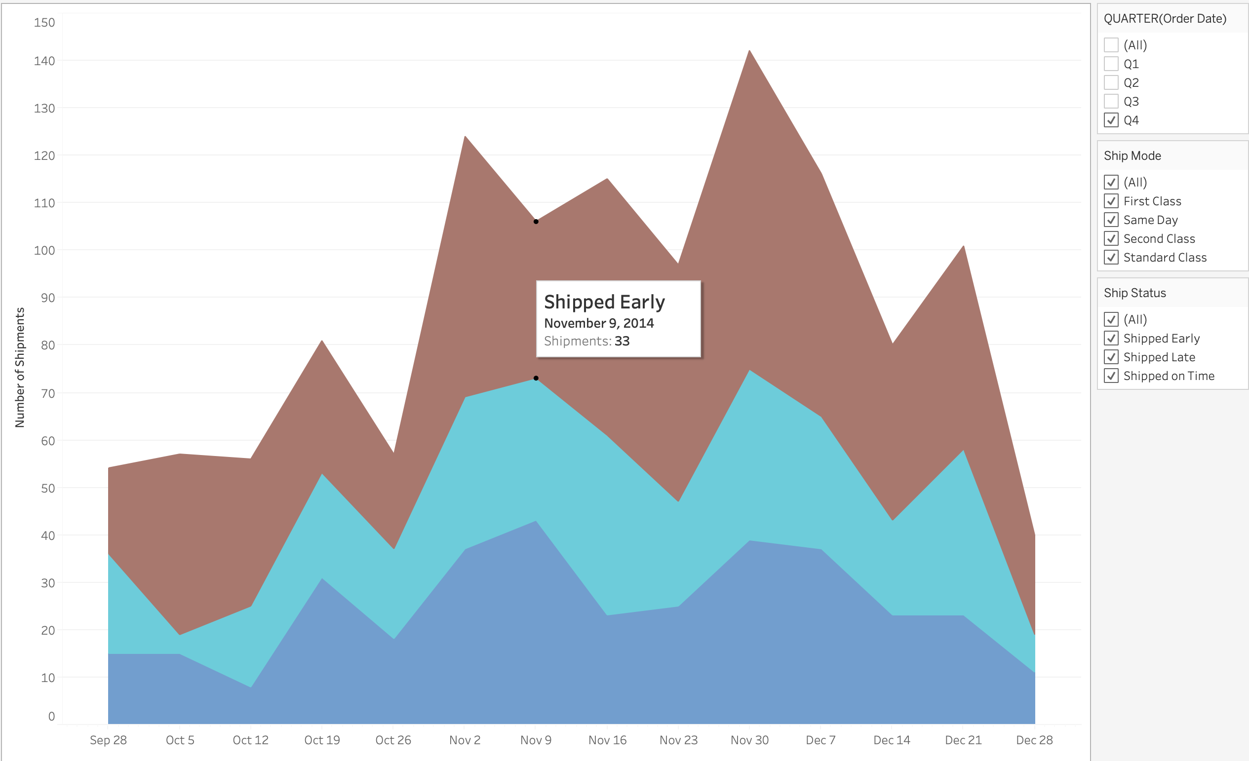
Click here to view the dashboard
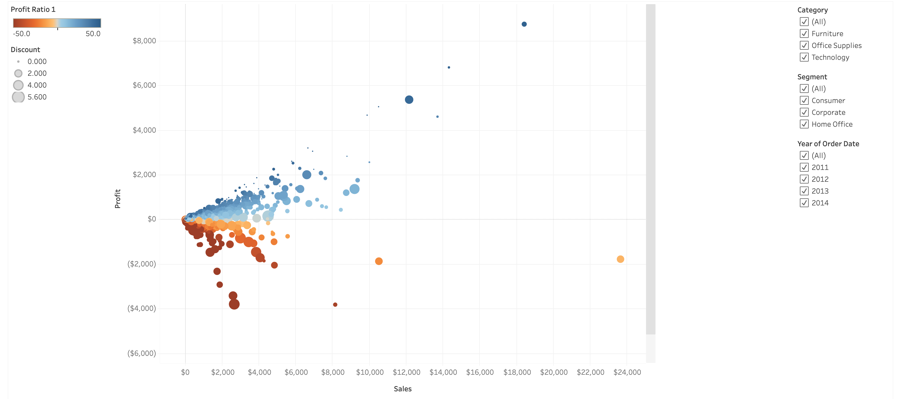
Superstore Customer Scatter Plot
This is a visualization for the assignment in Visual Analytics with Tableau. The goal was to present a scatter plot of sales and profit per customer by region. The assignment also required the color of the circles to reflect the profit ratio and the size of the circle to reflect the discount. The filters for the visualization are Category, Segment, and Year of Order Date.
Click here to view the dashboard
Superstore Sales 2011 - 2014
This is a visualization for the assignment in Essential Design Principles for Tableau. The goal was to present the three worst performing sub-categories per region in terms of sales revenue to the VP of Sales. I also included my answers to the assignment.
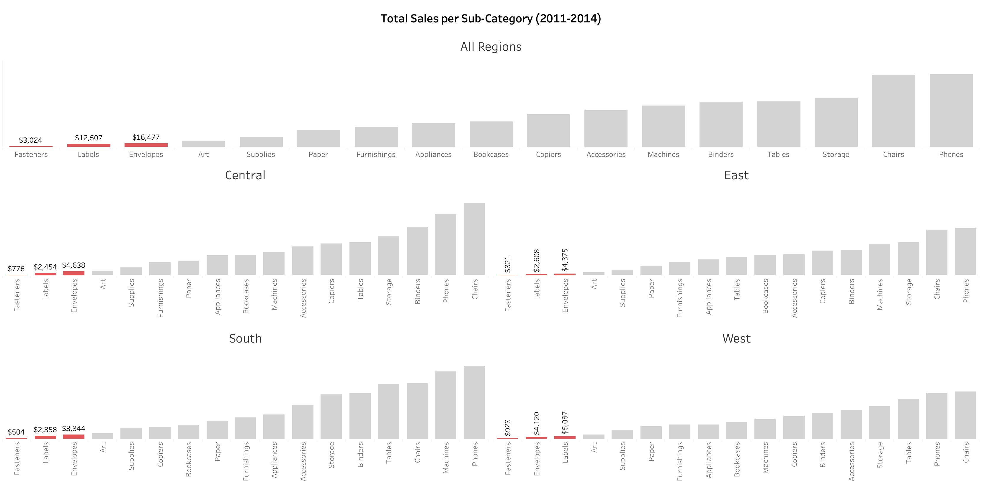
How does your visualization leverage at least one “pop-out effect” or “pre-attentive attribute?” Which one(s) was (were) chosen and why?
The pre-attentive attribute of color was chosen to make the least 3 profitable sub-categories pop-out of the bar chart. Red was chosen to represent the low sales performance of the sub-categories. A light grey color was chosen to represent all the other categories to make the data available as additional information for comparison in the background.
How does your visualization utilize at least one Gestalt principle? Which principle(s) is (are) being reflected, and how?
The Gestalt principle of similarity was utilized. The sub-categories colored in red indicate similarity. The similarity is that all three sub-categories are the worst performers in the region.
How does your design reflect an understanding of cognitive load and clutter?
The Y axis was hidden and labels were used only for the three worst performing sub-categories. The gridlines were also hidden. These help in directing the audience’s attention to the requested data - the three worst performing sub-categories.
Is your visualization static or interactive? Why did you choose that format?
The visualization is static because the VP of sales is not looking to explore the data anymore. She just wants to know the three worst performing sub-categories so she can cut it. She also has limited face time with the executives and needs to give a quick answer instead of telling a detailed story with the data.
What need does this visualization address that words or numbers alone cannot fill?
Comparing the sub-categories is fast and easy because of the use of a bar chart in ascending order. Using words or numbers to do this wll take time and mentally visualizing the comparison might lead to a misinterpretation.
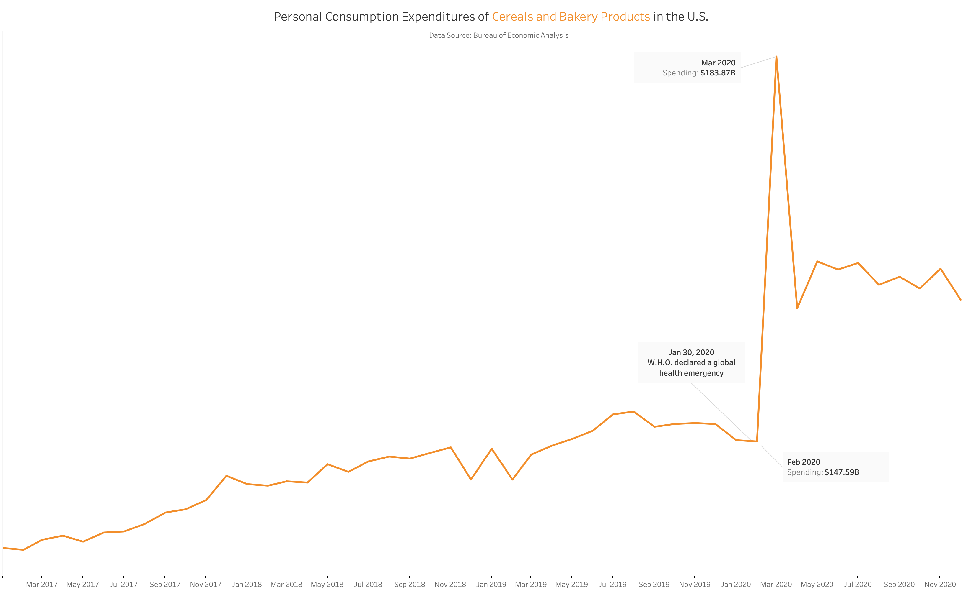
Personal Consumption Expenditures of Cereals and Bakery Products in the U.S.
This is my submission for #MakeoverMonday. The graph to be made over was posted in Bloomberg. It shows the personal consumption expenditures of cereals and bakery products since 1959 up to 2020.
I wanted to focus on the years 2017 - 2020 to show how the COVID-19 pandemic affected the expenditures.
Top 5 Killers in Game of Thrones
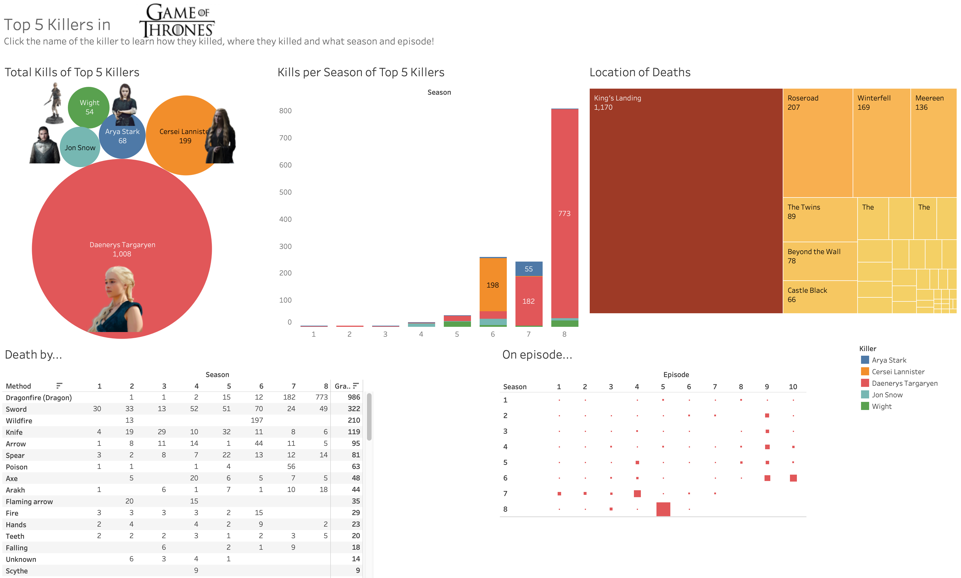
Click here to view the dashboard in Tableau
Have you ever wondered what episodes in GoT are the most violent? This dashboard displays the top 5 killers in the entire series. Start by clicking the circle of the killer on the top left. You’ll then find out how many they killed, what season and episode, and how they did it.